GxP Validation Website

Users are struggling to find necessary information to make informed business decisions.

Disclaimer: Identifying brand information has been removed where possible to respect company privacy. All visuals and design work belongs to the client and I was not involved in the creation of any updated assets or branding decisions.

Strategy

Reduction of cognitive load to convert more users into requesting consultations for sales

Proposed Solution

Streamline navigation utilizing user research and analytical data to craft logical hierarchy and reduce cognitive load

Impact

Measurable 20%+ increase in high-intent traffic over a 6 month period

The Brief

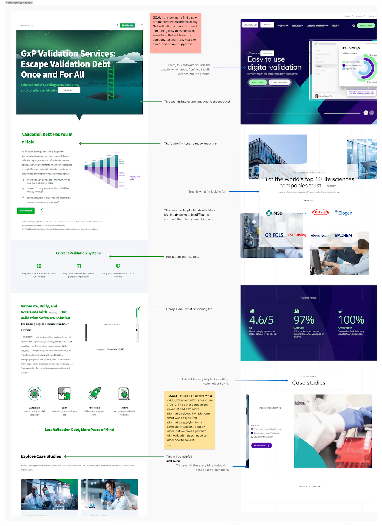
A start-up reached out to me with concerns about conversion for their website as they began planning for the next stage of product release. Their bounce rate was significant at around 65% as a minimum with some pages (including high value) as high as 80%. In addition, most of their site traffic was driven to specific pages as direct links from LinkedIn marketing campaigns, leading to very little further exploration about the company's offerings.

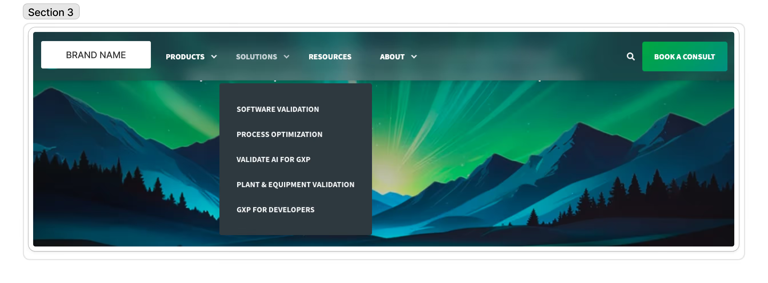
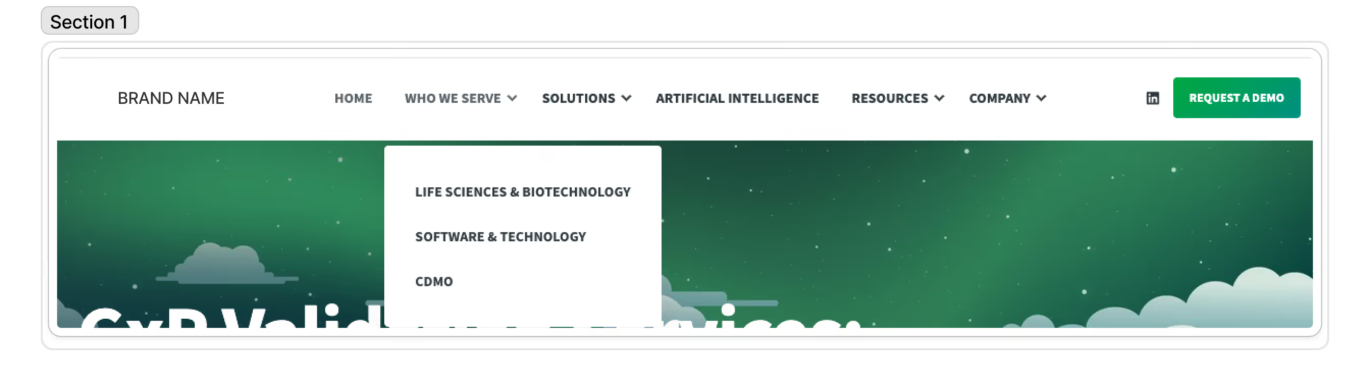
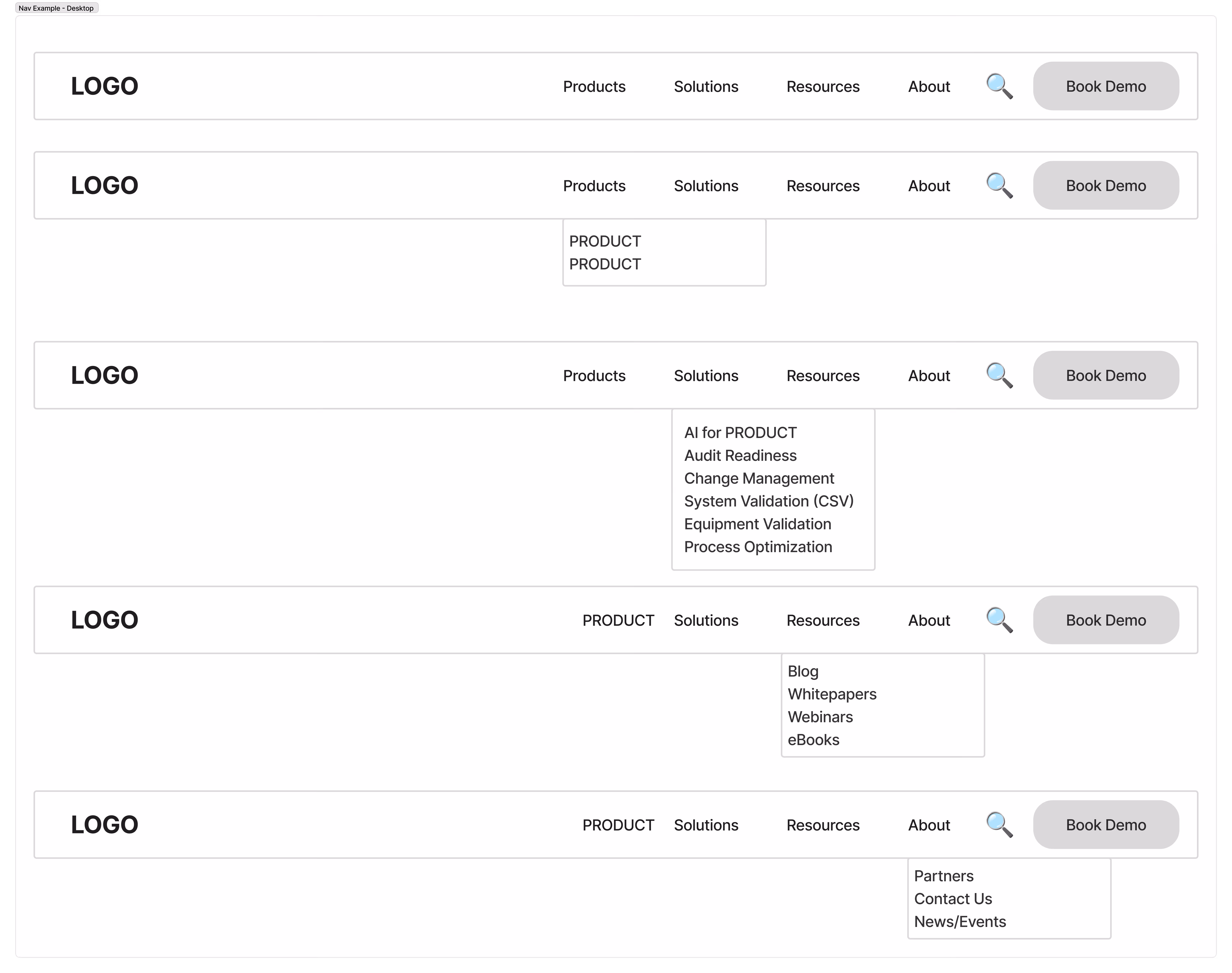
The client asked for the site to be audited and the navigation reconfigured. It was a fairly straightforward sounding request, but in a category I had never yet worked in, there was a lot to learn in a short time. I began with a competitor audit, current site audit, and current navigation assessment.
Side-by-side comparison of two digital validation service web pages with annotations highlighting key differences in product descriptions, trust signals, validation systems, and case studies.

Finding the gaps in competiton and tagreting specific users

There were a few snags upon digging deeper. Many of their competitors were much larger companies and had a large range of products, however that also led to much of their content being templated and almost identical in order to flood SEO. Ultimately, that made it equally difficult for users to find the exact product they were in need of. This was identified as a gap where my client had an advantage. Working with their SEO agency, it would make it easier to target users searching for specific features.
A detailed persona matrix titled 'Quality Leader (Ideal)' outlining customer journey steps Awareness, Consideration, Decision, and Retention with sections for Story, Actions, Touchpoints, User Thoughts, Pain Points, Tone Gap Analysis, and Opportunities focused on compliance, trust, and platform efficiency.A user persona chart for an ideal IT leader showing journey steps Awareness, Consideration, Decision, and Retention with corresponding story, actions, touchpoints, user thoughts, pain points, tone gap analysis, and opportunities. Key needs include reduced operational burden, seamless tech stack integration, and automation. Blockers are legacy systems, resource constraints, and rapid release cycles. Goals focus on easy onboarding and integration.Table outlining the journey steps of a Digital Transformation Leader across Awareness, Consideration, Decision, and Retention phases, listing story, actions, touchpoints, user thoughts, pain points, tone gap analysis, and opportunities, alongside needs, blockers, and goals for modernization and future-proofing tech.
This led to the ultimate solution I would decide upon for the new hierarchy of the site. If we didn't have multiple products to copy and paste, we would play up the feature impact of our products and target specific user personas for highest conversion possibilities.

Implementing the research into results

After clarifying design and engineering capabilities with the team, I began adjusting the current site map into the future one that would go far beyond simple website impact. The updated navigation began to shift how marketing approached the brand and began to reach out to clients. We moved from a deep and nested hierarchy to a flatter one with much higher scannability.

The project had already gone beyond a simple site map redesign. I had begun impacting their very sales and marketing decisions, providing ways to decrease path-to-value clicks and simplify content to remove barrier to entry for conversion. For me, user experience and working with my clients is greater than simply taking their requests at face value. There is often a deeper problem in need of solving, and for this client it was a struggle to convey their capabilities and convert those highlights into sales.
Given the intent for site maps to be viewed on desktop sized screens for presentation, images may need to be zoomed into for clarity on mobile devices.

Old Sitemap

Site map

Updated Sitemap

Simplified sitemap diagram with main sections: Home, Products, Solutions, Resources, About, and Book Demo, showing subpages and CTAs with color-coded key.

Expanded Sitemap w/ Content Sections (Example)

Chart example of expanded site map including multiple sections and header information

LoFi Updated Navigation Example

Five versions of a website navigation bar with a logo on the left, menu items: Products, Solutions, Resources, About, a search icon, and a Book Demo button; some versions show dropdown menus under Products, Resources, and About.

In conclusion...

Since hand-off in Q3 of 2025, there have been vast improvements to the site analytics:
Monthly Organic Traffic
22%
growth
Avg. Bounce Rate
25%
improvement
Path-to-Value (Clicks)
55%
faster access